
Page 4 - Green Builder Magazine July 2015 Issue
P. 4
EDITOR’S NOTE By Matt Power, Editor-in-Chief
The Inside Scoop
2
Making the Data Real
Sometimes we need to visualize what numbers really mean.
www.greenbuildermedia.com 07.2015 IDON’T THINK MOST people can Why visualize numbers this way?
empathize with raw numbers. For To replace rumor with facts. There’s an
IMAGE CREDIT FOR “THE CLIMATE REALITY PROJECT example, in my home town of Portland, assumption that the homeless population
Maine, a new article comes out every is connected with a spike in police
day about our lack of social services. incidents, but maybe those petty crimes
The city is bursting with homeless, are rooted in another cause. What do the
immigrant and transient visitors. Now numbers say? Show us visually how our
that we’ve reached a crisis point, balancing summer crowd breaks down. How many
between a generous, open door policy people are short-timers? How many
and an increasingly tense street scene for own homes, rent a room or sleep on a
residents, what’s the best way forward? friend’s couch? Show us another graphic
This is an example of where visualizing illustrating where they have come from.
the numbers could clarify and change policy. For example, How many are locals? Paint us a picture that will help us
we might start with a graphical map of the city showing: 1. understand the real story—then we can emotionally connect
Where the current homeless shelters are, plus a graphic of the and logically arrive at solutions.
number of available beds; 2. Locations and capacity of social This same approach is ideal for presenting environmental
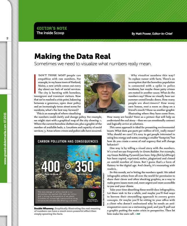
services; 3. Areas where crimes and police calls have occurred. issues. What does 400 parts per million of CO2 really mean?
Why should we care? It’s easy to get people interested in
Double Whammy. Graphically illustrating the real meaning using less energy and water, creating a smaller “footprint,” but
of numbers can have a much more powerful effect than how do you create a sense of real urgency that will change
simply spouting the facts. behavior?
One way is by telling a visual story with the numbers.
It’s a tool we use frequently in Green Builder. For example,
my Green Building Pyramid (see here: http://bit.ly/1dHsvgr)
has been copied, reprinted, stolen, plagiarized and cloned
an untold number of times. But I guess that’s a form of
flattery in the digital age. And clearly, it’s resonating with
readers.
So this month, we’re letting the numbers speak. We asked
infographic artists from all over the world for permission to
share their clever and often shocking graphics, as a way to
make green issues more real, more urgent and more accessible
to you and your clients.
Take your time absorbing these world-class infographics.
Let them sink in for a while, and maybe you’ll find ways
to borrow their storytelling approach to convey green
concepts. Or maybe you’ll be sitting in your office with
a client who doesn’t understand why he needs an anti-
evaporative cover on a swimming pool, and you’ll pull out
a graphic putting the water crisis in perspective. Then let
him make his own call. —MP